Maison MIHARA YASUHIRO Jingumae bldg
“SLOPE” (NOSE SHOP)
Jingumae, Tokyo
Nov, 2025
retail store
Direction: Mihara Yasuhiro
Interior Design: Insideout ltd.(Hiroto Kubo)
Construction: Ishimaru co.,ltd. + Mihoya Glass Co., Ltd.
Lighting: HIBIKI, Inc.
Sound: Whitelight
PHOTO: KOZO TAKAYAMA
掲載記事 / Articles
Superfuture | Casa Brutus | 商店建築2026年3月号 | FRAME


「NOSE SHOP SLOPE」
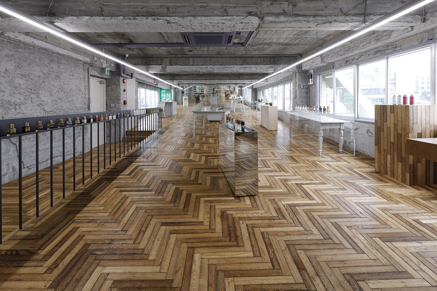
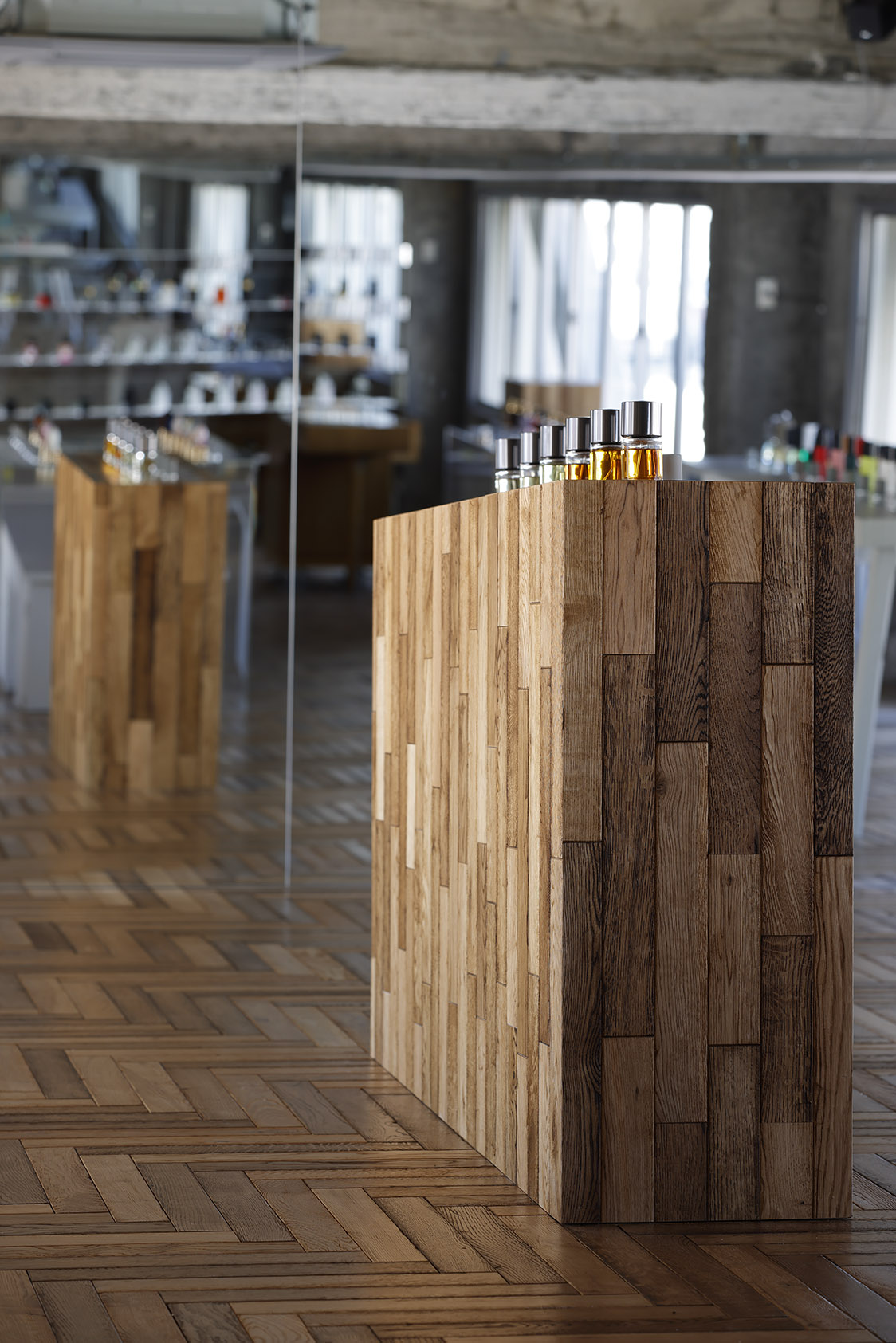
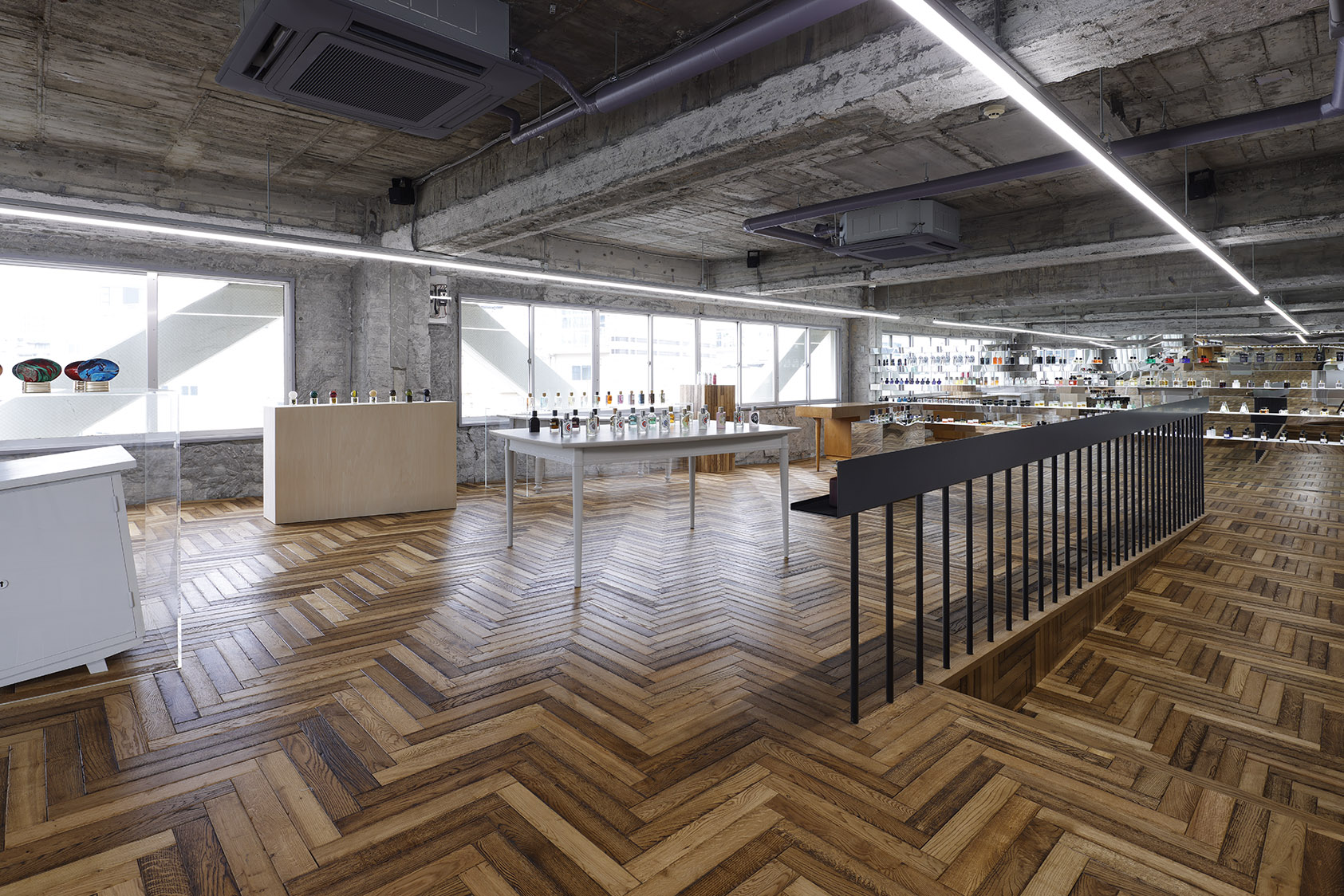
On the fifth floor, “NOSE SHOP SLOPE,” the theme is the five senses, the floor is gently inclined to heighten bodily awareness. The key challenge was keeping display tops level to stabilise perfume bottles within the sloping room. Rather than hiding the adjustments, the design turns them into “play” — cutting table legs and subtly lifting fixtures so the gap between perception and function becomes part of the atmosphere.
五感をテーマとし、床を緩やかに傾けている。身体感覚を伴う条件のなかで、香水のボトルの安定を確保するため、什器天板の水平性をいかに成立させるかが焦点となった。テーブル脚の切断や什器のわずかな持ち上げなど、レベル差の解消自体を“遊び”として扱い、知覚と機能のズレを、場の印象へと転換している。
On the fifth floor, “NOSE SHOP SLOPE,” the theme is the five senses, the floor is gently inclined to heighten bodily awareness. The key challenge was keeping display tops level to stabilise perfume bottles within the sloping room. Rather than hiding the adjustments, the design turns them into “play” — cutting table legs and subtly lifting fixtures so the gap between perception and function becomes part of the atmosphere.“古くから神宮前に存在する建造物を、未完の状態にしたいという私のエゴからこの空間づくりは始まった。2023年10月に同ビルにオープンしたコンセプトショップ「裏」に続き、ここから「表」が始まる。ビルの外観や1つ1つの部屋を繋ぐ共用部分には手を加えず、あるいは削り出すことで建物がまとってきた“古さ”という時間の概念を残している” MIHARA YASUHIRO
古いビル一棟を、ファッションブランド「Maison MIHARA YASUHIRO」の旗艦店へと改装するプロジェクト。
ビルは5フロアに分節され、経年や更新の蓄積によって生まれた『古さ』を手がかりとして再解釈し、設計の起点とした。既存仕上げと新要素の間合いの取り方、フロアごとのテーマ設定、そして全体を貫く一貫した態度̶̶これらをデザイナー三原康裕氏との長期にわたる対話を通して、内装設計でありながら建築的思考として組み立てている。
同ビルの路面店「裏 | URA」でのアプローチと同様に、「新/旧」「外/内」「重/軽」といった対比の関係を、単なる演出ではなく、空間の領域設定や境界線の操作として織り込んでいる。各階は異なるテーマを持ちながらも、既存躯体に対して新たな層を“被せる/離す/ずらす/切断する”といった操作が全体に通底し、古い建物の存在を消し込むことなく、層の厚みが空間の印象として折り重なる。
3階「WALL」では、既存壁の存在や空間構成を直接的に感じさせないよう、外周を端正なクラシック調の什器で囲い込み、内側の輪郭を引き直した。整える操作と壊す操作を同時に重ね、什器上部をダメージを受けたようにガタガタに切断し、欠き取ることで輪郭を崩し、粗い梁面や天井との隙間から外光が微かに差し込む状況をつくる。壁を隠しながらも、壁との“距離の厚み”を光と断面で感じさせ、新旧の関係を視覚と距離感として浮かび上がらせた。
2階「GLASS」では、荒々しい既存壁の質感を硬質なガラスで覆うように囲い、新旧マテリアルの強いコントラストを伴って室内の輪郭を与えている。ガラスに嵌め込まれたスピーカーユニットが、壁とガラスの間にある空気層を振動させ、あいだに置かれたプロダクトが音環境にも影響する要素となる。床全面に流し込まれた樹脂の光沢、ガラスエッジのシャープな線、その中に点在するプロダクトが、境界と商品を同時に強調している。
1階「COUNTER」では、マッスな大理石ボリュームの上にスニーカーが並び、マテリアルの質量差と量塊のスケールがプロダクトの存在を際立たせ、空間のコントラストとして現れる。表通りへ斜めに突き出すガラスファサードは、既存室内壁との間に隙間を生み、外部空間を室内へ引き込む。外部との境界線がずれて領域が交錯する状態を実験的に組み込み、内外の関係がふと切り替わる瞬間が生まれている。
フロアを移動するたびに場のルールが切り替わり、その変化が次のフロアへの期待をつないでいく。上下の回遊の中で、建物全体がひとつの連続した体験として静かに印象を深めていく。
“Old layers kept visible in Maison MIHARA YASUHIRO’s five-floor flagship renovation”
“From my ego — the urge to leave this long-standing Jingūmae building unfinished — this space began. After the concept shop ‘URA’ opened here in October 2023, ‘OMOTE’ starts now. We left the façade and shared corridors untouched, or only carved away, so the building could keep the time it carries — its ‘oldness’.” — Yasuhiro Mihara
An ageing five-storey building has been remodelled into the flagship store for Maison MIHARA YASUHIRO, using the building’s accumulated “oldness” as the starting point rather than something to be erased.
Across the five floors, new interventions are set at carefully judged distances from existing finishes, while each level takes on its own theme. Developed through long-running dialogue with designer Yasuhiro Mihara, the project treats interior work as an architectural exercise: establishing a consistent attitude that holds the whole building together.
Echoing the approach used in the same building’s street-level shop URA | URA, contrasts such as new/old, outside/inside and heavy/light are embedded as spatial devices—used to define territories and manipulate boundaries, rather than simply to create effects. Throughout, a shared set of operations—overlaying, pulling away, shifting and slicing—runs across the floors, allowing the existing structure to remain legible while new layers accumulate as a palpable thickness.
The third floor, “WALL,” is conceived to suppress any direct reading of the existing walls and original room proportions. Classical, composed fixtures line the perimeter to redraw the inner outline, but their upper edges are then violently disrupted—cut jagged and partially gouged out. Thin slices of daylight seep in through gaps against rough beams and the ceiling, and the “thickness” between old wall and new lining is registered through light and section rather than exposed surfaces.
On the second floor, “GLASS,” raw existing walls are enclosed by rigid glass, sharpening the room’s outline through a hard material contrast. Speaker units embedded in the glass vibrate the air gap between wall and screen, so products placed within the cavity become part of the acoustic environment. A glossy resin floor and knife-sharp glass edges further heighten the sense of boundary, while simultaneously spotlighting the merchandise.
At street level, “COUNTER,” sneakers sit atop a massive marble block. The weight and scale of the stone amplify the products by contrast, turning material mass into display strategy. A diagonally projecting glass façade opens a narrow void against the existing interior wall, pulling the street into the room. By letting boundaries slip and overlap, the design creates moments where inside and outside briefly exchange roles.
Moving between floors, the spatial “rules” reset each time—linking difference to anticipation.
Through vertical circulation, the building reads as a single, continuous sequence that deepens quietly as visitors climb.